


Caseco
September 2023

Project Type:
UX/UI Design
Year
2023
Owner
Bijou
About the Company:
Caseco is a company founded in 2010 that specializes in creating affordable mobile phone accessories made from sustainable and durable materials. They were established to offer high-quality products without the need to pay for expensive brand names. Caseco manufactures luxury-quality products and sells them directly to customers online, maintaining costs around 50% less than traditional luxury brands. They focus on using eco-friendly materials, including recycled materials and ethically sourced leathers, aiming to create products that can be passed down to future generations.
Caseco, a tech accessory brand that sells directly to consumers, unlike its parent company, Wireless Xplosion who operates solely as a B2B. After uncovering that our website and social platforms didn't appeal to the mass consumers of tech accessory industry. By reassessing and refocusing on the correct demographic, we aim to enhance brand awareness, relevance, engagement and market competitiveness.
Task:
Re-design Caseco's brand & website, to target the accurate demographic and audience and increasing brand awareness.
About the Project
Hypothesis Statement:
Based on my research, I believe that Caseco clients need to provide a friendlier, more trustworthy site with clearer affordances, and better hierarchy, so that they are encouraged to move past the landing page and ultimately, make a purchase. In addition to, Caseco needs to redesign the style of their brand, so that they are able to appeal to the correct demographic and build brand awareness.
Result:
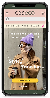
Caseco's desktop and mobile site now appeal to the demographic shown in our research. Allowing them to build up their reputation and awareness as a brand.
40+
Screens
100+
icons & illustrative elements
2
weeks

Tools:
Responsibilities:
Despite being managing 3 creatives at the time of this project, I was the sole designer for this project.

Research:

Prior to officially joining the Wireless Xplosion team, I had conducted a very quick audit of the site in comparison to its competitors and immediately was able to point out a major User Experience issues which I highlighted on this Miro board.
The owner was also unsure as to why Wireless Xplosion was excelling whilst Caseco's sales remained stagnant. When the problem was initially brought to my attention and that wallet cases specifically, remained to be Caseco's best selling product, I assumed it could be that they were targeting the wrong demographic. When I had looked at their site, I believed that the appeal and brand awareness was non-existent for Caseco. As having some experience being a consumer of phone cases myself, and having purchased from Caseco's competitors like Casetify and Burga, I had my assumptions and theories as to why, from a UX standpoint, Caseco was having such a difficult time keeping up with the market.

On Caseco's landing page, I found many glaring UX issues that could be contributing to the sites incredibly high bounce rate.

Using Miro, I did a heuristic evaluation and took a look at the competitive landscape as well as Caseco's current landscape:

Site Activity

SimilarWeb
80.08 %
Bounce rate - which is over double of Caseco's competitors
Total Visits
59.4K
30 Seconds
Spent on Caseco's site -- where competitors have an avg. of 3 minutes
Target Audience
Due to the lack of information for Caseco, I looked at their competitors to see what the main consumer demographic was for tech accessories:

64.82% Females
70.52% Females
Pela
Otterbox
Burga
47.22% Females
Casetify
Casemate
Velvet Caviar
54.39% Females
78.07% Females
55.47% Females
Based on my research, the majority of our competitors consumers are females between the ages of 18 - 34.
Problem Statement
Based on my research, I believe that Caseco clients need to provide a friendlier, more trustworthy site with clearer affordances, and better hierarchy, so that they are encouraged to move past the landing page and ultimately, make a purchase. In addition to, Caseco needs to redesign the style of their brand, so that they are able to appeal to the correct demographic and build brand awareness.
Solution Statement
How might we improve the navigation structure to make it easier for users to find relevant content or features?
How might we enhance the accessibility features of our site to ensure inclusivity for users?
How might we create a stronger brand identity and rapport with our clients?
User & Business Goals

-
Intuitive User Experience: to find the product they want with ease.
-
Accessibility Features: tactile/hover feedback.
-
Aesthetics: users appreciate an appealing design on the site & products that aligns with their style.
-
Newness: Unlike B2Bs, consumers will need newness. They will not need to buy the same products repeatedly.
-
Optimize User Engagement: through user centered design principles, iterative testing, and continuous improvement.
-
Enhance Brand Awareness/ loyalty: to build up clientele & to prioritize having clients over customers.
-
Increase Conversion Rates: by offering products/ experiences that effectively address user needs & painpoints, driving purpose intent.
USER GOALS
BUSINESS GOALS
Information Architecture:


The navigation on the site was not intuitive, there were a lot of products, and overall was very overwhelming with information. Some of the products or information were also difficult to find, so I ended up conducting some card sorting, to establish where the products/ information should be placed within the navigation.
-
information and products would also be divided into separate web pages (ex. under the "Our Story" dropdown menu, mission statement would be one page, values would be another page, and about us would also be a separate page (& this applied to other sections in the dropdown menu)
I believed that without a proper "about us" page-- and understanding the value of a reliable "about us" webpage (having written an article on it here), especially as a small business to build brand reputation, I felt that this was really hindering the rapport between Caseco and it's clients.

In this process, I also sorted out the copywriting. The company has an SEO and Copywriting professional but was too dependent on Ai and SEO focused- thus creating discrepancies between the products.
For example 2 products that were the same, such as the clear case for the different iPhone generations, they were labelled very different product titles due to what was ranked high for SEO at the time of that specific products release. And when the new generation of iPhone came out, that models product title varied from the previous model.
Design Iterations:
Due to the timelines fixed for this sprint, I focused mostly on creating low-fidelity wireframes to receive feedback and suggestions before moving onto the final prototype:


Brand Guide:
After iterating on my sketches, I created a brand guide and redesigned the logo to align with what Caseco wants their brand to feel and portray to their shoppers. They already had some brand colours that they were set on, like the light green, but they wanted something a bit more fun to appeal to their younger audience. I began sketching out some potential logo ideas before presenting it in a branding pitch.


Testimonials
"I am thrilled to write a heartfelt testimonial for a remarkable UX designer. Bijou recently created a logo and drew stunning graphics for my business, and I cannot express how grateful I am for the exceptional work delivered. From the moment I approached Bijou with my ideas and vision, I was immediately impressed by their professionalism and passion for their craft. They took the time to understand the essence of my business, its values, and the message I wanted to convey. This thorough understanding translated into a logo and graphics that perfectly captured the spirit of my brand. Bijou's expertise in UX design is evident in every aspect of their work. The logo they designed not only embodies the core values of my business but also manages to be visually captivating and memorable. The attention to detail and creative flair demonstrated in the graphics they drew are beyond compare. Each element, color, and shape was meticulously crafted, resulting in a cohesive and aesthetically pleasing visual representation of my brand. Working with Bijou was an absolute pleasure. They were not only a consummate professional but also a great listener. They patiently listened to my ideas, offered valuable insights, and seamlessly integrated my feedback into the design process. Bijou's ability to collaborate and communicate effectively ensured that the end result surpassed my expectations. The impact of Bijou's work on my business has been remarkable. The logo and graphics they created have undoubtedly elevated my brand's image and identity. Customers have consistently praised the design elements, noting how visually appealing and well-aligned they are with the products and services I offer. Bijou's design work has undoubtedly contributed to increasing brand recognition and attracting a wider audience. I wholeheartedly recommend Bijou to anyone seeking a UX designer who can transform ideas into visually captivating and impactful designs. Their passion, professionalism, and extraordinary talent make them an invaluable asset to any project. If you are looking for a logo or graphics that truly represent your brand's essence, I have no doubt that Bijou is the perfect choice. Thank you, Bijou, for your exceptional work and dedication. Your creativity and attention to detail have left an indelible mark on my business, and I am immensely grateful for the opportunity to collaborate with someone as talented as you." - Natasha Gordon, REALTOR®️